

The Steelers symbol is one of the most recognizable logos in the NFL. The Steelers symbol, based on the Steelmark logo from the American Iron and Steel Institute, has a rich history that adds depth to its simple design. This iconic logo, with its three diamond shapes, tells a story about the steel industry and the team’s proud heritage.
Originally created by U.S. Steel, the Steelers symbol represents the three materials used to produce steel: coal, iron ore, and steel scrap. Over time, this emblem has become more than just a logo; it’s a symbol of resilience and success for the Pittsburgh Steelers. In this blog post, we’ll explore how the Steelers symbol came to be and why it has remained a significant part of the team’s identity.
The Origins of the Steelers Symbol: From Steelmark to NFL Icon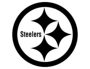
The Steelers symbol has a fascinating origin story. It all began with the Steelmark logo created by U.S. Steel in the 1960s. This logo featured three diamond shapes, called hypocycloids, each with a different color representing a key material in steel production: yellow for coal, orange for iron ore, and blue for steel scrap. The design aimed to promote the importance of steel in everyday life and became a staple of marketing for the steel industry.
In 1962, the Pittsburgh Steelers decided to adopt this logo for their helmets. At that time, the team was looking for a way to stand out and showcase their connection to Pittsburgh’s steel industry heritage. They approached the American Iron and Steel Institute (AISI) to use the Steelmark logo. After some adjustments, including changing the word “Steel” to “Steelers,” the emblem was officially adopted. This unique choice set the Steelers apart from other NFL teams, making their helmet logo an iconic symbol.
Key Points:
- Steelmark Origins: The logo was first created by U.S. Steel to represent the steel industry.
- Adoption by Steelers: The team began using it in 1962 after obtaining permission from AISI.
- Design Meaning: Each diamond shape in the logo symbolizes a different material used in steel production.
What the Steelers Symbol Really Means: Breaking Down the Design
The Steelers symbol is more than just a design; it tells a story about the steel industry and the team’s roots. The logo features three diamond shapes in different colors: yellow, orange, and blue. These colors are not random; they each represent something important. Yellow stands for coal, orange represents iron ore, and blue signifies steel scrap. Together, these colors highlight the components that make up steel, emphasizing the industrial heritage of Pittsburgh.
Each diamond shape is known as a hypocycloid, a geometric shape used in the original Steelmark logo. The design’s purpose was to showcase how steel benefits society by making work easier, enhancing leisure, and expanding possibilities. By incorporating this symbol into their logo, the Steelers pay homage to the city’s industrial past and celebrate the role steel plays in everyday life.
Key Points:
- Color Meanings: Yellow, orange, and blue represent coal, iron ore, and steel scrap, respectively.
- Design Purpose: The shapes and colors highlight the significance of steel in society.
- Symbolic Heritage: The logo connects the team to Pittsburgh’s steel industry history.
Why the Steelers Only Use Their Symbol on One Side of the Helmet
One interesting fact about the Steelers helmet is that the symbol appears only on one side. This choice wasn’t initially planned to be permanent. In the early 1960s, when the team first tested the logo, they placed it on just the right side of their gold helmets. This allowed them to evaluate how the logo would look before making a final decision.
The decision to keep the logo on one side became a unique trademark. The Steelers liked the way the logo looked and the interest it generated. As a result, they decided to maintain this distinctive feature. Today, this single-sided logo is a beloved part of the team’s identity, setting them apart from other NFL teams.
Key Points:
- Initial Testing: The logo was first placed on one side to test its appearance.
- Unique Trademark: The one-sided logo became a distinctive feature of the team’s helmets.
- Continued Tradition: This unique design choice remains a significant aspect of the Steelers’ brand.
The Evolution of the Steelers Symbol: How It’s Changed Over Time
Over the years, the Steelers symbol has undergone some changes but has remained largely the same. When the team first adopted the logo, it was used to highlight their connection to Pittsburgh’s steel industry. The design has stayed true to its origins, but its usage has evolved with the team’s success and branding efforts.
Throughout the decades, the logo’s prominence on the team’s helmets has remained constant. However, the surrounding elements and marketing materials have changed to reflect modern styles and technologies. Despite these updates, the core design of the Steelers symbol—three diamonds in yellow, orange, and blue—has remained a symbol of pride and tradition for the team and its fans.
Key Points:
- Design Consistency: The core design of the symbol has remained unchanged.
- Modern Updates: Surrounding elements and marketing materials have evolved.
- Pride and Tradition: The symbol continues to represent the team’s legacy and success.
How the Steelers Symbol Became a Cultural Icon Beyond Football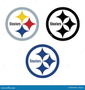
The Steelers symbol is not just a sports logo; it has become a cultural icon. Beyond football, the logo represents the city of Pittsburgh and its rich industrial history. Fans of the team and residents of Pittsburgh proudly display the emblem on everything from clothing to home decor.
The logo’s influence extends beyond the field. It has appeared in various forms of media and popular culture, symbolizing resilience, pride, and community spirit. The Steelers symbol has become a powerful representation of Pittsburgh’s identity, linking the city’s past with its present and future.
Cultural Impact:
- City Pride: The symbol is a source of pride for Pittsburgh residents.
- Media Presence: It has appeared in various media and popular culture.
- Community Spirit: The logo represents the resilience and unity of Pittsburgh.
By understanding the rich history and significance of the Steelers symbol, fans can better appreciate its role in both football and the broader cultural landscape.
Conclusion
The Steelers symbol is more than just a logo; it’s a piece of history and pride for both the team and the city of Pittsburgh. From its origins with the Steelmark logo to its unique placement on the team’s helmets, this emblem tells a story of heritage and identity. It connects the Steelers to Pittsburgh’s steel industry and has become a recognizable symbol of both football and local pride.
As the Steelers continue to succeed and inspire, their symbol remains a timeless reminder of their roots and achievements. Whether you’re a long-time fan or new to the team, understanding the meaning behind the logo adds depth to your appreciation of the Steelers and their rich history.
FAQs
Q: Why does the Steelers symbol have only one side of the helmet?
A: The Steelers logo appears on only one side of the helmet because it was first tested that way. The team decided to keep this unique feature due to its distinctive look and the positive response from fans.
Q: What do the colors in the Steelers symbol represent?
A: The colors in the Steelers symbol represent different materials used in steel production: yellow for coal, orange for iron ore, and blue for steel scrap.
Q: Who created the original Steelmark logo that inspired the Steelers symbol?
A: The original Steelmark logo was created by U.S. Steel in the 1960s to promote the importance of steel in everyday life.
Q: Why did the Steelers change the word “Steel” to “Steelers” in their logo?
A: The Steelers changed “Steel” to “Steelers” to customize the logo for their team, connecting their identity to Pittsburgh’s steel industry.
Q: How has the Steelers symbol changed over time?
A: The core design of the Steelers symbol has remained the same, but its use and surrounding elements have evolved to reflect modern styles and technologies.
